Brand Kit
Our energy,
our expression
Brand Kit
V1 · 2026
01 / PRINCIPLES
What we believe in
We make energy easier to understand. The brand should therefore feel as clear as the decision we help the customer make.
Clear over smart
Explain it before we impress with it. Technology is only interesting when the value is clear.
Home over product
We start with the home, everyday life, and consumption – not with panels, batteries, or specifications.
Facts over superlatives
Document the value. Use savings, payback, consumption, and impact rather than big promises.
Calm over noise
EcoRay is energetic, not frantic. We use contrast, movement, and color with a clear purpose.
02 / LOGO
Logo
The logo needs breathing room and contrast. Use the green or dark background as your first choice and avoid effects, outlines, and random color combinations.
Do
Give the logo space
Let the brand stand free and clear. As a rule of thumb: at least one symbol width of clear space around the logo.
Don't
Don't embellish it
No glow, shadows, gradients, rotation, compression, or alternative colors on the logo itself.
03 / COLORS
Colors
EcoRay Green is an active signal – for CTAs, key data, energy, and highlights. The dark green-black creates a sense of calm and premium contrast.
04 / TYPOGRAPHY
Typography
Funnel Sans carries the narrative. PP Supply Mono is used for labels, numbers, system info, and small technical signals.
DISPLAY
Good energy should last
HEADLINE
See what makes sense for your home
BODY TEXT
Write short paragraphs with a clear message. Give the user one argument at a time and let numbers or documentation do the work where possible.
05 / TONE OF VOICE
Tone of voice
We are competent without sounding technical for the sake of it. The language should make the decision easier – not bigger.
Concrete
Say what the customer gets, saves, does, or can understand.
Calm
No panic, pressure, or excessive urgency. Good decisions should feel manageable.
Human
Write to the homeowner, not to an energy report.
Documented
If we make a promise, we should be able to show the math behind it.
HOW TO WRITE
See what solar panels can do for your home and your finances
Concrete, relevant, and without promising more than we can document.
AVOID
Revolutionize your green future with intelligent energy technology
Too generic, too abstract, and disconnected from the customer's actual decision.
06 / IMAGE STYLE
Image style
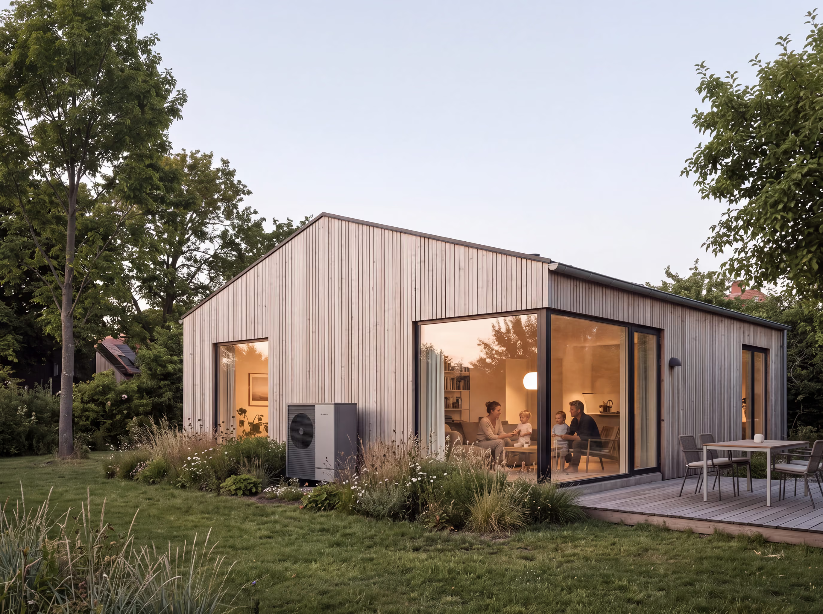
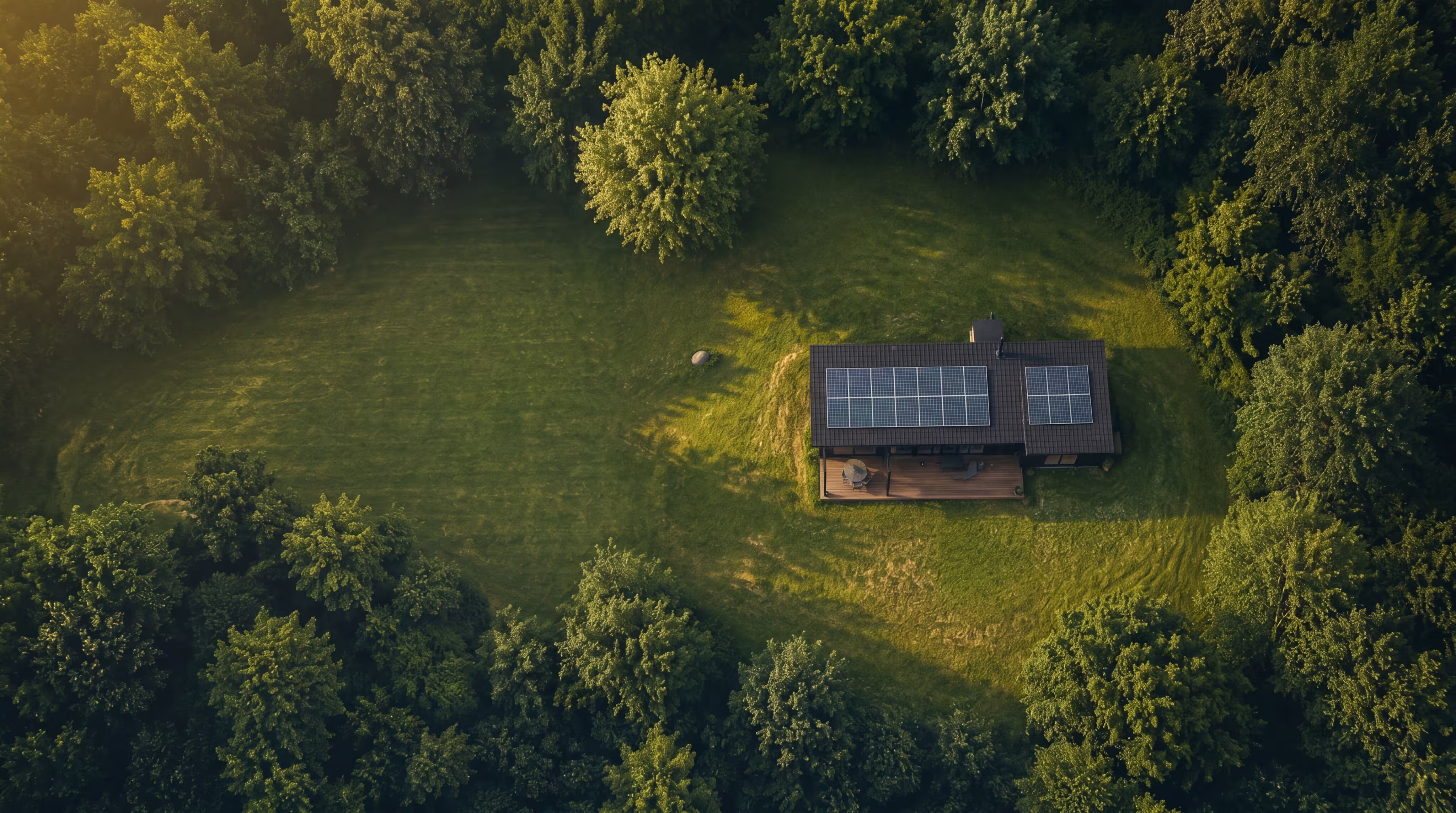
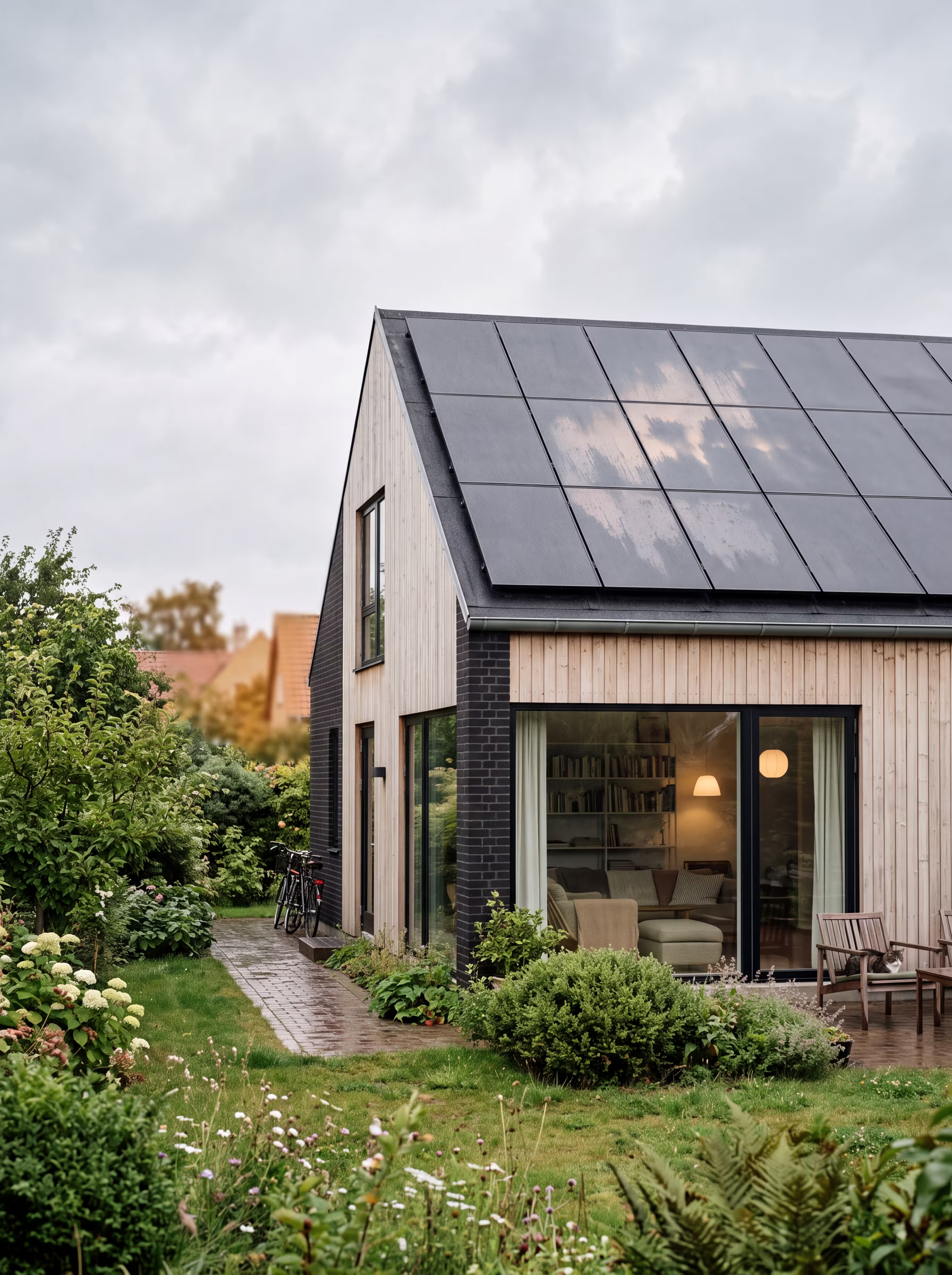
The photography should feel Scandinavian, observational, and real. Architecture, light, and everyday details over classic stock motifs.

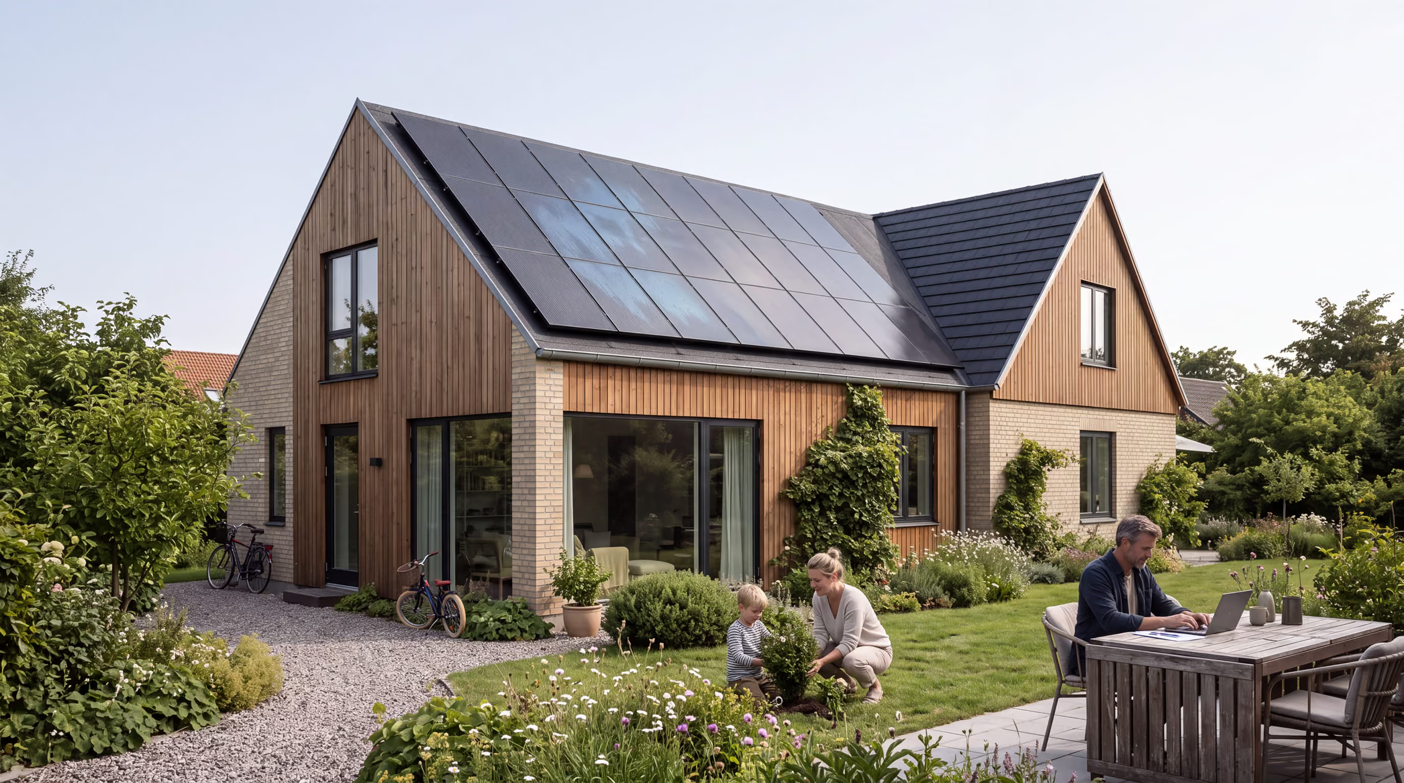

Natural light, Nordic materials, lived-in homes, calm compositions, architecture, and energy as an integrated part of the house.
Handshakes, stiff business portraits, excessive sustainability symbolism, plastic AI looks, and images where the technology feels pasted on.
07 / GRAPHIC LANGUAGE
Graphic language
The graphics should feel like a system surrounding the home: precise data, simple geometric cuts, and green energy signals.
LIVING AREA
EXPECTED SAVINGS
CURRENT HEAT SOURCE
RECOMMENDED SOLUTION
Use asymmetrical cuts as a subtle signature – not as decoration on every element.
SOLAR ENERGY
YOUR HOME
ECORAY FLOW
Mono-labels provide a sense of system and make complex information easier to scan.
THE ROOF
CONSUMPTION
The future
08 / MOTION
Motion
Motion shows connections and energy flow. It should be tactile and lively, but never compete with the message.
POSSIBLE SELF-SUFFICIENCY
AUTOMATIC OPTIMIZATION
POTENTIAL ANNUAL SAVINGS
01
Show cause and effect
Let movement explain how energy moves between the sun, battery, heat pump, and home.
02
One movement at a time
Keep the direction clear. Avoid multiple simultaneous loops, pulses, and overlays.
03
Smooth acceleration
The feel should be smooth and precise – more energy flow than tech interface.
09 / MARKETING
The brand in use
Campaigns should be easy to decode in seconds. Start with a relevant problem or result and build from there.
FINANCING
Spread the investment over time
Individual credit approval
SERVICE / PEACE OF MIND
Good energy should last
01 · LABEL — Context or category
02 · CLAIM — One clear idea
03 · PROOF — Numbers, data, or concrete benefit
04 · CTA — One natural next step
10 / QUICK REFERENCE
Download and use
Download the original logos and quickly find your way back to the image style and marketing principles. Use the approved fonts from your project files.
LOGO
EcoRay Symbol
Original symbol in SVG. Deep Green on a transparent background.
Download symbol · SVGLOGO
EcoRay Wordmark
Original wordmark in SVG. White on a transparent background.
Download wordmark · SVGMARKETING
Marketing cheat sheet
The most important rules for external partners and agencies.
See the marketing guide ↗